| Home What we do Storytelling for User Experience Articles and downloads About us |
|
Voting for Usability: by Whitney Quesenbery I've been working as an interface designer for eleven years. Many things have changed during that time, but the one constant is that our focus has always been on making the technology fit the user rather than the other way around. I'm happy to say that this is an idea that has gained more currency recently, though we still have a long way to go. The explosion of the web and all of the e-commerce sites started helping business and the public see the problem. Tasks we thought of as simple - like paying for something we wanted to buy - were suddenly revealed to be more complex, difficult and error-prone than we were willing to accept. In a world that is moving fast, perhaps too fast, people started to demand that software and technology be able to keep up with them, and work effortlessly. In this environment, the finale to the 2000 presidential election simply
galvanized the country's attention on the concept we call usability. Why Talk about Voting Why were we so mesmerized? A dozen or more interface design companies issued statements or created web sites to talk about the ballot. After the election, organizations from the Usability Professionals' Association to Computer Scientist for Social Responsibility to the National Organization of the Disabled to educational institutions like CalTech and MIT started projects to work solve the problems as they saw them. So, why talk about voting? The answer is pretty simple. First, voting is the ultimate usability problem. There is a huge, and diverse, user population who must be able to use the interface. The system is used infrequently, and the interface is never exactly the same. There are different candidates, different offices, and even the relative position of the political parties changes from time to time. To top this off, the context of use is stressful. Users have only one chance to get it right, and are working in an unfamiliar environment. We used to say that bank machines, ATM's, were the most difficult interface design challenge. After all, you are asking a customer to execute a financial transaction - with their own money - standing on a street corner. But, the use of the ATM is voluntary and the service is offered by many different banks, so there is some choice. Only one voting system is available to any one voter, and the whole process can be intimidating - both official and formal That leads to the second reason why the whole question of the usability
of voting systems is so compelling. The results matter. Maybe it's that we'd all like to work on something important. Maybe it's that we were all simply shocked that something so simple could go so horribly wrong that thousands of people could not use it correctly. Or that it is in the unusual moments - when business does not go as usual - that we really understand how things work. There's one more reason. For those of us who have been advocating usability, it was fascinating to see our specialty catapulted into headlines. This seemed like the perfect moment to explain to our friends and relatives what we do, and why it's important. What Happened For those of you who were not glued to your television screen, web page
or newspaper last November, let's briefly look back at what happened.
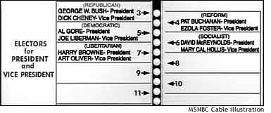
This ballot design is called a butterfly ballot because the two pages of candidates surround the column of punch holes like the wings of a butterfly. Where Do Ballots Come From To understand how the actual ballots are created, you have to understand that elections in the US are administered locally, typically by a County Clerk or records keeper and the Board of Elections. If the first step in good user-centered design is contextual inquiry and understanding the users of a system, this is the place to start.
In Palm Beach County, Florida, the Supervisor of Elections is Theresa LaPore, who has worked in that office since 1971. One of the things that LaPore and her counterparts do for every election is make up the ballot. The format for the ballot is determined by the voting system, so in some ways it is a routine task. Candidate names and parties are filled in following a formula. For example, the presidential candidate for the party of the current governor is listed first on the Florida ballot. The parties and other officials check the ballot, and it is distributed to all registered voters in an informational brochure before the election. There is some leeway in the design of the ballot. LaPore made the text on the ballot bigger, but this only exacerbated the problem of aligning the presidential ballot where three lines, for the party, and both presidential and vice presidential candidates must be listed.
Were users dummies? This ballot doesn't look that difficult, but on election day and immediately afterwards, there was a flood of people complaining that they had difficulty voting.
Quotes from officials sound like technologists everywhere. To me, this sounds just like software design discussions in which someone will inevitably say something like "but users should know how to…." It's what happens when people are so close to the technology that they can no longer understand how it appears to a 'regular person.'
What happens when the technology of voting systems is looked at closely?
Technology of Voting Systems Let's look at the technology of voting systems. You can see that it's a patchwork of different systems in use around the country. Each jurisdiction decides what technology to use, so only a few states even have a single standard across the whole state.
This image is from an interactive page on the
USA Today web site, showing all of the different voting systems in use
in the united states. There are five basic types of voting systems in current use.
A variety of DRE systems is Internet voting. Although a lot of research and experiments are under way, there are important security and authentication problems which must be solved. In the 2000 election, there was a non-binding Internet vote in several counties in California, and 84 overseas military personnel participated in a pilot project. Use of both optical scan and DRE systems has almost doubled since 1992. For me, one of the most interesting statements in the FAQ on Voting System Standards is this "Note that the standards address only what a voting system should do, not how the system should do it." That exactly echoes what we in the usability community have said is the problem with software design. To quote Dr. Charlie Kreitzberg of Cognetics "The problem with software development is that we usually get the functionality more or less right but we get the process more or less wrong. This happens because we focus on what software should do rather than how it should do it." What this suggests is that the problems users have with voting systems may be able to be directly traced back to a lack of user-centered design and usability. With the necessary focus on technology and security issues, the voting experience has been disregarded. How well does the technology work? There are many sources of information, but one of the most succinct (and up-to-date) is the testimony at a Congressional Committee on Science Hearing on Improving Voting Technology in May 2001. The introduction to these hearings acknowledged many "consider (current standards) to be inadequate, suggesting that national standards must be expanded in scope to address factors such as ballot design, election management, and voter error. Solutions are likely to consider such diverse factors as cost, speed, accuracy, security, reduction in voter errors, and ease of use." Two of the witnesses were Dr. Stephen Ansolabehere of the CalTech/MIT
Voting Project and Dr. Rebecca Mercuri of Bryn Mawr College. Errors at Every Step The CalTech/MIT project is working on a comprehensive report of the current state of voting technologies as a precursor to work on new system design. In their report, they identify errors which can take place at each step in voting.
All of this comes down to a question of what error rate we can accept, although it may not be politically acceptable to admit that any errors can be predicted. There were over 29,000 invalid votes in Palm Beach County - more than 6% of the total. Nationwide, we routinely accept error rates of 3% - 4%. Why? Simply because those numbers would not affect the outcome of the race. What made the 2000 race so fascinating was that it was one of those rare occurrences when we were close to a statistical dead heat, given the error rates. I'm not going to rehearse any of the statistical arguments. I'm not a
statistician, and cannot do justice to the arguments. At any rate, except
for one issue which I will discuss later, they don't really affect how
we look at the usability of the ballot itself. Usability and the ballot
The real question is 'why accept errors at all?' The software industry has routinely accepted the premise that some percentage of users will not be able to use any given program with usability: that is, efficiently, effectively and with satisfaction. This premise has led to a productivity slump that we are just coming out of, as businesses begin to realize that computers that don't work with people, that don't reflect the way tasks are really performed, that don't help prevent errors waste time and energy that could be better spent actually doing a job. The bottom line is that it takes an understanding of the human factor to make a system that works. This means the human factor in administering elections - and a lot of attention is being focused on this aspect of the problem - but also the human factor of the voter and the environment in which votes are cast. Lessons for designers The real question for most of us is not how to fix the voting process
in the United States, or even in our own precinct. I'll talk a little
bit at the end about some opportunities for contributing to that work.
What I'd like to talk about now is what lessons we can learn for our own
work. Quality and Usability are Different There is certainly a relationship between quality and usability, but they are different, and look for different types of problems. A quality inspection looks for things like correctly spelled names, consistent use of typography and whether all names on the ballot are valid and in their correct position. The first two can be determined with a simple visual inspection of the ballot; the last two require knowledge of election laws. But none of these tests require any knowledge of the context of use. A usability inspection looks for very different kinds of problems. A standard that required the ballot to help prevent errors would mean looking for any ambiguity in the voting mechanism. An examination of readability includes not only the font size, but the spacing between the candidate names and other design elements such as the lines and arrows to be sure they contribute positively to the overall effect. Finally, a usability test looks at context of use. The ballot would be examined in the voting machine so it is seen in the same way it will appear to users. And, the entire environment is considered - how the polling place is organized, the availability of replacement ballots, the table or stand at which voting takes place and so on. Instructions are part of the interface
How many of you receive ballots or other instructions in the mail before an election? Do you study them? Or do you assume that this task is so simple that you will be able to walk into the voting booth and complete the task without error? One problem with the instructions in Palm Beach is that they are not precisely correct. Step 4 says to "vote every page." Except, of course, the page with the presidential election, which spanned two pages. Unfortunately, in some areas with large numbers of new voters, the instructions were boiled down to "vote every page." What happened here is partly just a matter of poorly written documentation. But another truth that technical writers know all too well is that the best instructions cannot make up for poor design. And the butterfly design is poor - at least for these machines. After the election, a group of scientists in Canada tested a butterfly ballot design to determine whether this design is more likely to confuse voters. Their results, published in Nature Magazine, reported that "three of four errors occurred against the candidate who occupied the same position as Al Gore on the Palm Beach County ballot" - that is, the second position in the left-hand column. Their conclusion is that the butterfly ballot is significantly more confusing than a single-column ballot. In other words, it may not have been possible to write instructions that would overcome the bias in the design. Although no one has admitted it, there must have been an awareness at least on some level that the ballot was confusing, because these signs were posted for poll workers asking them to remind voters to vote for only one presidential candidate, and to use the numbers to locate the correct hole to punch. Little things count All of this leads to a basic truth of design, that little things count. It's the little things that add up to a usable system. In all of the analyses by interface designers, statisticians, human factors and psychology experts, none of the explanations were a real smoking gun. Besides avoiding the double column design, there was nothing that anyone could point to and say unequivocally "that was the big mistake" In fact, one of the lessons is that it is easier to make things worse
instead of better with a misguided design change. Remember that one of
the reasons two columns were needed was that Supervisor LaPore was trying
to make the ballot more readable. She knew she had many elderly voters,
and increased the size of the type to help them see the ballot better.
Jakob Nielsen has been widely quoted as saying that you only need to test with 5 users to find 100% of the usability problems with an interface design. But, he bases this assertion on an assumption that the design process is iterative and that each successive revision to the design will be re-tested. There is a difference, however, between testing a perfectly awful interface with many, many problems and finding subtle flaws in a simple interface which works correctly for 99% of the users. The problem is that the 80-20 rule is simply not good enough for voting. And it may not be good enough for your e-commerce or intranet site, either. Statistics matter Bob Bailey of Human Factors International did a calculation of the number of users it would take to find the problems as experienced in Palm Beach County. His calculation is that only 1 in 100 voters had a problem. He then applied a mathematical formula to show that it would take close to 500 people to be sure of uncovering a problem. However, you can increase the chances of finding usability problems by careful selection of test participants. Are you testing only with experienced computer users? The review process for the butterfly ballot was to show it to two co-workers in the County Supervisor's office and send it to each of the major parties. All people, in other words, who are deeply involved in the electoral process. Perhaps this usability testing seems too expensive? The simple truth is that every interface is usability tested. The only question is whether you control the test environment or not. How many millions of dollars did the county, state and political parties spend on the recounts and court battles? Even a $50,000 test budget seems minimal in this context. One of the things that puzzled me was why voters didn't complain at the
poll, or at least ask for help and a new ballot. It isn't that all the
stories came out after the close election was known. The Democratic party
reported that their phones started ringing as early as 8:00 in the morning
with people who were worried that they had spoiled their ballots. Newspapers
picked up the story in the early afternoon, well before it became evident
that Florida would be the deciding state in the election. Users Don't Complain Caroline Jarrett, is an expert in forms and works extensively with official forms such as the tax forms in her native UK. She reports reviewing a pile of real forms and discovering that 100% of them had errors of some kind. You would think that this kind of error rate would produce an outcry in the general public, if not within the agency that created them. But she also reports that users are often very hesitant to complain about official forms, even when they are clearly having problems with them. Complaining takes effort, and people usually want to get the unpleasant episode over as quickly as possible. They will only make the effort when they are very upset or when they think that their complaints will produce results. Unfortunately, they often do not have anyone appropriate to complain to. Poll workers have little means to fix the problem, and are more concerned
with moving voters through efficiently. Perhaps in this light, calling
the candidate's office was actually sensible, if too late to make a difference. How easy is it for you to blame the users for being 'stupid' or not taking
the time to learn how your product, documentation or web site works? The simplest thing you can do to improve the usability of your own work
is to make sure there are open channels for communication - and listen
to what comes across them. Whether it's your sales channel, your technical
support logs or the email that comes in to feedback@yourcompany.com every
time someone takes the time to talk to you, you should listen. Observe Users in Context When I first started looking into usability and voting, one of the most surprising things I found was how little research has been done on voting. One of the few papers based on any real user analysis - as opposed to expert reviews or statistical analysis - is a 1998 paper entitled Disenfranchised by Design by Susan King Roth. Her studies videotaped people during the actual 1992 elections, using both mechanical lever machines and punch card systems. Her findings revealed design problems in several areas, including the size and legibility of text. One conclusion was that the arrangement of the information on the ballot influenced users. She also concluded that human factors such as the voter's height and visual acuity were as important as the somewhat stressful context of voting itself. Her photographs, for example, show some items on the ballot well over the head of the voter. A tall reviewer, or a reviewer looking at the ballot as a printed sheet spread out on a table would have no chance to notice this problem. Voting is a particularly difficult task to observe, given our tradition of the secret ballot. But everyone who has tried to get started with usability has encountered problems gaining access to users. Sometimes they are remote, and there is no travel budget to reach them. Or the task is infrequent and therefore difficult to observe. Or private, such as a financial transaction. Whatever the case, it will take more than cleverness on the part of usability advocates to gain regular access to users. Good user-centered design processes are part of a customer-focus…and just good business. King says that the people in her studies were "willing and able to provide constructive and valuable feedback" - if someone was just willing to ask. Who is just waiting to help you improve your work? Accessibility There is one other point about the context of use that must be made. This year, with the new Section 508 of the American Rehabilitation Act, there has been heightened awareness of the need to make web sites and other information technology accessible to all. The National Organization on Disability is conducting a non-partisan project to increase the number of persons with disabilities who vote. Many of the barriers are physical - polling places without good access - but many are in the design of the voting system itself. Their web site includes guidelines for polling place accessibility, and a comparison of different voting systems. Their conclusion is that Direct Recording Electronic systems are the most accessible, although not without other problems. Mechanical systems such as levers or punch cards are inaccessible to the visually impaired as well as to those with dexterity limitations. Systems using paper ballots including optical scan and paper ballots have similar problems. Are you making sure that you have looked at your work from the perspective of someone with a disability? This is important not just because it's the law, but because people exist on a continuum of capabilities. One person may have permanent severe dexterity limitations, while others may have some limitations or simply have a temporary disability from an injury or illness. A voting system is truly the "any user" interface - but I've sat in many, many design meetings for web sites where the typical user was described as "anyone." If we really mean that, our sites must be accessible. Design principles Let's look at some of the design principles that come into play with voting interfaces. The most important may be whether the user interface prevents errors and helps the user recover from any which are made. Mechanical or electronic systems can prevent duplicate votes - so-called overvoting - where two votes are cast for the same office. One way to prevent errors is to design the system for direct manipulation.
We've all gotten so used to the web, where links are (when done well)
a perfect example of direct manipulation: you point, click and are taken
to a new page, hopefully related to the text of the link you selected.
Susan Roth King concludes that there is a "sequence of interconnected factors: the failure to apply effective design principles at the system development stage; the lack of comprehensive federal guidelines related to system usability; and unfamiliarity with information design and usability issues at the local (level)." At the heart of this quote is the best advice I can possibly give: nothing replaces a good user-centered design process, based on good design principles and incorporating usability evaluation with an appropriate number of real users. One usability test thrown into the schedule just before the product releases will only tell you whether you have a disaster on your hands, not help you make the design changes that will prevent it.
This talk was presented as a Spotlight Session at TECH*COMM 2001 on July 16, 2001 in Washington DC The URL for this article is: http://www.wqusability.com/articles/voting-background2000.html Whitney Quesenbery works on user experience and usability with a passion for clear communication. She is the co-author of Storytelling for User Experience from Rosenfeld Media. Before she was seduced by a little beige computer, Whitney was a theatrical lighting designer. The lessons from the theatre stay with her in creating user experiences. She can be reached at www.WQusability.com |
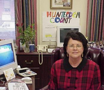 The
woman in the photograph is Dorothy Tirpok, the County Clerk from Hunterdon
County, New Jersey where I live. She's…'just a person', not a concept
like "local government" but someone who comes in to work every
day, has a family and is part of the communty. The Board of Elections
- more regular people - manages voter registration, and supervises 107
polling places with some 500 election workers.
The
woman in the photograph is Dorothy Tirpok, the County Clerk from Hunterdon
County, New Jersey where I live. She's…'just a person', not a concept
like "local government" but someone who comes in to work every
day, has a family and is part of the communty. The Board of Elections
- more regular people - manages voter registration, and supervises 107
polling places with some 500 election workers. 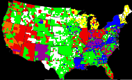
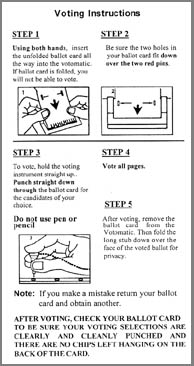 It's
no news to the people who write documentation that instructions are part
of the interface. The booklet mailed to voters in Palm Beach County contained
not only pictures of the ballot, but instructions on using the voting
machines. But did they help?
It's
no news to the people who write documentation that instructions are part
of the interface. The booklet mailed to voters in Palm Beach County contained
not only pictures of the ballot, but instructions on using the voting
machines. But did they help?