|
Language and Usability
Usability is an important part of good technical communication. Many
writers incorporate usability techniques such as site visits, user task
analysis and usability testing into their work.
We can see how closely usability and document design are related in two definitions by leading experts. In both of these definitions, the goal is to ensure not only that their product is useful, but that it helps the users succeed in their own work.
But we can also look at the relationship from the other direction. If usability is part of technical communication, language – the building block of technical communication – is an important part of the usability of a web site or software application. The better a product communicates, the more helpful it is, the easier it is to use.
When user assistance and instruction are woven into the interface, users learn seamlessly, as part of the natural experience. This is especially true in web applications, where marketing, instructions and the actual application all converge in a single window.
A helpful interface is a usable interface
Even a simple user interface, such as this form are filled with words – over 100 of them in this part of the form alone.
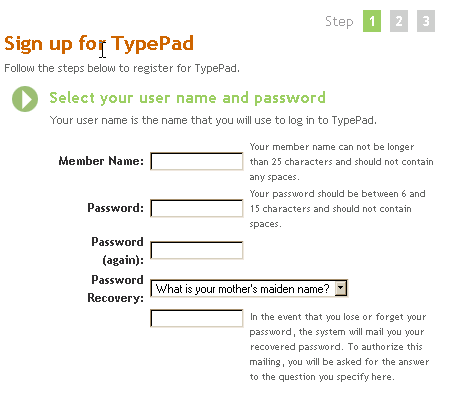
(Screen captured from www.typepad.com)
Let’s look at how these words are used, and how they enhance the usability of the sign up process.
First, we need to understand a little more about the context in which the form is used. This is the sign up for a free trial of an inexpensive online blog service. The business goal is to make this as simple and easy as possible so that people will try the service.
There will be many different kinds of people who sign up, each with their own goals, but one persona is especially interesting, because she’s a new kind of customer, and one who might need a little extra help to be willing to sign up.
| 
- 29 years old
- Works in a travel agency
- Uses the web and email for personal use
- An avid user of IM to talk to her friends
|
ELAINE
Elaine just bought her first house, and has started to renovate it. She uses the web regularly for both information and entertainment. For example, she found a site with how-to tips for some tricky problems like re-hanging her windows.
Lately she’s seen a number of sites that are a sort of diary of bike trips. She likes the format a lot, and thinks that it might be an easy way to keep her family and friends in touch with progress on her renovations. She wants to be able to write postcards, with pictures, with all her progress.
One of the sites calls itself a “blog” so she Googles the word looking for information. She finds the TypePad web site and decides to sign up for their free trial so she can test it out.
|
Now, that we’ve met Elaine, let’s look at how the sign up form helps her successfully register to use the service.
-
The title is an active instruction, and includes a tag line that clearly states the purpose of the form – “follow the steps below to register…”
-
The first step is marked with a bullet image, and is also written as a clear instruction.
-
Even better, a short prompt below the instruction lets Elaine know why she needs a user name and a password. She’s going to use this user name a lot, so she wants to make it one she can remember easily.
-
As she starts to fill in the form, she sees that there are short explanations for each field, giving her the reason why this information is needed, or hints on how to fill it in correctly. This text is clearly of lesser importance, but having it available right on the screen means she doesn’t have to click on a help link to read the information.
-
The page is also nicely designed, with a clear grid, and use of color to help highlight the headings.
Even without a usability test to collect real users reactions, we can guess that this form makes Elaine feel more confident in signing up, and increases her sense that this will be a good company to work with.
(This is an example created for this article, and not a real screen from this site)
|
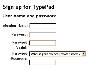
Did you notice that many of the things that make this form better involve language and information design?
For a comparison, let’s take a look at this form without them. This form is simple enough that Elaine might not have any problems supplying the information it ask for, even without the good headings, prompts and explanations. If the form was more complex, however, or Elaine was a little hesitant about creating a user name, this version does not do anything to help her.
The user assistance in this form makes the difference between on that offers a friendly, helpful experience and one that is prone to errors or misunderstandings.
|
Making interfaces helpful
The process of making a web page or application helpful is similar to the process for designing any user assistance. Four principles can guide your work:
- Be informative. Don’t make users guess at what the form, page or application will do or what the web site is for.
- Be understandable. Use language and terminology that are meaningful to the audience.
- Be helpful. Provide instructions throughout the process, putting the information where it is needed.
- Anticipate. Answer questions before they are asked.
In order to follow these principles, you must learn about the people who will use your products. What are their goals? What questions do they have about your product or service? What will help them have a successful experience?
Understanding the answers to these questions will help you not only create better technical documentation, but can also help you improve the usability of the product.

This article was published in the maaziner Tekom 2004 (Weisbaden, Germany), and accompanied a keynote presentation of the same title. The presentation slides and proceedings notes are also available. This article is also posted on the Tekom web site and has been reprinted by the IEEE Professional Communications Society.
The URL for this article is: http://www.wqusability.com/articles/language-usability-tekom.html.
语言和可用性 (Chinese translation):
http://www.wqusability.com/articles/language-usability-cn.pdf
Posted November 15, 2004
Whitney Quesenbery works on user
experience and usability with a passion for clear communication.
She is the co-author of Storytelling for User Experience from Rosenfeld Media. Before she was seduced by a little beige computer, Whitney was
a theatrical lighting designer. The lessons from the theatre stay with her
in creating user experiences. She can be reached at www.WQusability.com |